


The UK first edition hardback of I Would Rather Stay Poor by James Hadley Chase, published by Robert Hale in 1962. Now, taken merely as a book, this is a fairly unremarkable item. It's one of umpteen crime thrillers that Chase – real name Rene Brabazon Raymond – wrote; witness the list of prior books opposite the title page:
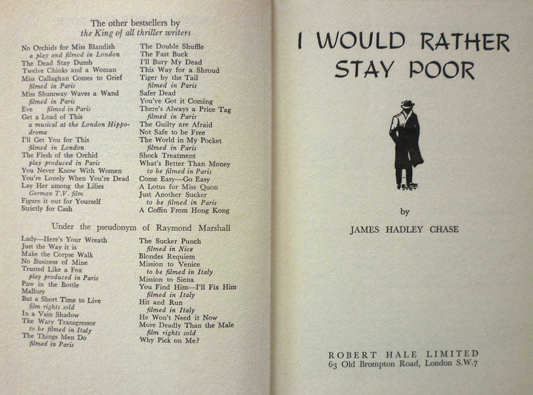
Or indeed the comprehensive bibliography on this online tribute. It's a well-regarded but not especially notable entry in Chase's oeuvre, and it's not especially scarce in first edition either – at present AbeBooks has twenty copies listed. Mine came from Stort Books in Essex – whose blog can be found here – who kindly delivered the book in record time because they knew I was eager to blog about it. And the reason I was so eager to blog about it is because the dustjacket was, of course, designed by Val Biro – and I'd very recently come into possession of not one but two pieces of artwork related to that jacket.
Val, you see, is represented by children's book dealer David Schutte – Val having written and illustrated many kids' titles, notably the Gumdrop picture books – and was David's guest at the Midhurst Book, Postcard & Ephemera Fair in West Sussex earlier this month. Since I live not too far away in Lewes in East Sussex, I popped across to the Midhurst event – which, unlike many British book fairs, seems to be thriving, and had expanded into another two rooms since last I was there – and had a brief chat with Val. He kindly signed the jacket of one of the books from my collection (which he'd actually forgotten he'd designed; more on that in a future post) and I had a leaf through some of Val's jacket roughs – the quickly painted versions of book jackets that Val would show to publishers for approval before painting the final version. Most of these were for books by authors I was unfamiliar with, but David told me that he did have a handful of crime novel jacket roughs, and promised to bring what he had along to the following weekend's Lewes Book Fair.
You can probably guess where this is going, can't you? Yes, in amongst the selection of roughs David showed me at the Lewes Book Fair were a few James Hadley Chase jackets – and the best of the bunch, to my mind, were these:


As you can see, Val actually worked up a pair of roughs for I Would Rather Stay Poor. One is obviously quite close to the finished dustjacket, but the other one is interesting too – partly because it shows Val's thought processes when creating the cover, but also because two elements of this alternate version did make it onto the final jacket. If we take a look at the full printed jacket, including the spine:

We can see that instead of the figure of the man on the original rough's spine, Val has swapped in the bottle and the bundles of cash from the front of the alternate version.
For me, the 1950s and '60s were the high watermark of British book cover design, as illustrators like Peter Probyn, John Rowland, Donald Green, John Dugan, Roy Sanford, Denis McLoughlin, Patrick Gierth and of course Val Biro brought their considerable, hard-earned artistic skill and craftsmanship to bear on a succession of striking, vibrant, and most of all memorable dustjackets. Val's two roughs for I Would Rather Stay Poor afford a tantalising glimpse of the creative process behind a cover, of the choices these artists made and the techniques they deployed: chiaroscuro, restricted palettes, dynamic hand-cut lettering. Titles and author names weren't pasted on after the illustration was created, as they are today; they were painstakingly painted as part of the whole piece, intrinsic to the overall design. Certainly in Val's case – and this was a surprise to me – jacket artwork was worked up at the same size as the finished jacket, not done at a larger size and then scaled down. And on one of Val's roughs, we can even see the notes he made for the gouache pigments he intended to use:


Val painted hundreds upon hundreds of dustjackets over the years, for books by authors as varied as C. S. Forester (a number of the Hornblower novels, plus, in their Michael Joseph editions, Randall and the River of Time, 1951; Plain Murder, 1952; and The African Queen, 1953), J. B. Priestley (The Magicians, Heinemann, 1954), Evelyn Waugh (the Chapman & Hall editions of Men at Arms, 1952; Officers and Gentlemen, 1955; and The Ordeal of Gilbert Penfold, 1957) and Victor Canning (the Hodder & Stoughton editions of The Dragon Tree, 1958; The Burning Eye, 1960; A Delivery of Furies, 1961; and Black Flamingo, 1962). My two James Hadley Chase roughs were produced for a book which is, by comparison, a minor literary work, but even so: I like them a lot, and for the insight they provide into how dustjackets were created fifty years ago, they are, in a sense, invaluable.

I'll have much more from Val Biro down the line, but next on Existential Ennui, I was planning on revealing the winners of my Ilex Gift giveaway... but I think I'll be squeezing in a bonus missive ahead of that, in which, inspired by this post, I'll be unveiling a brand new permanent feature on EE...
Great --but unusual-- title.
ReplyDeleteJames Hadley Chase certainly had a way with titles: More Deadly than the Male; Make the Corpse Walk; You Never Know with Women; You're Lonely When You're Dead; Figure it Out for Yourself (!); Strictly for Cash; Why Pick on Me?, There's Always a Price Tag; You Find Him, I'll Fix Him... the list goes on!
ReplyDeleteCovers really can make or break a book sometimes... very insightful post! :) I shared a link to this post on my blog today: http://authorjess.blogspot.com/2012/03/whats-up-wednesday-bookish-things-other.html
ReplyDeleteThank you, Jessica – and thanks for the link, too!
ReplyDelete